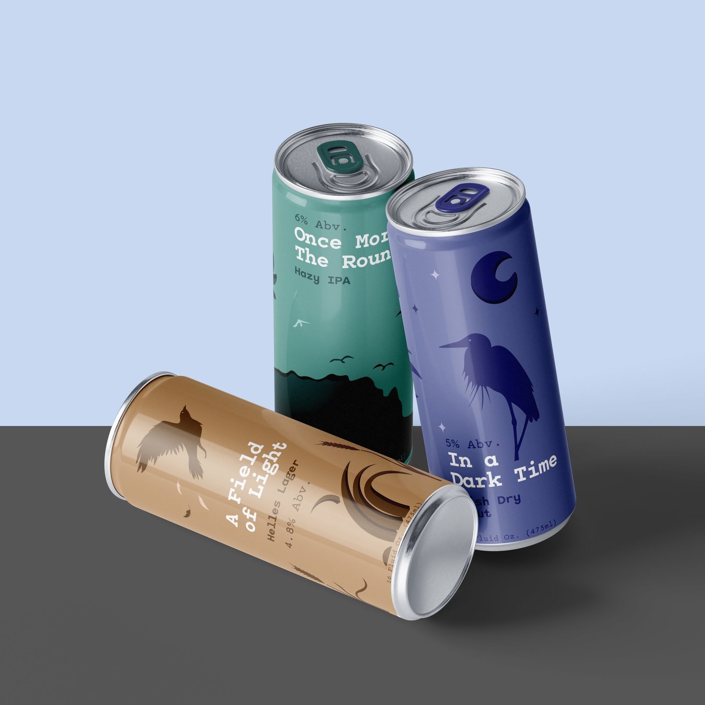
Theodore Roethke & Oracle Brewing co. Beer Cans
Date: 2025
Software: Adobe Illustrator
Theodore Roethke Poetry & Arts Festival and Oracle brewing Co. Partnership
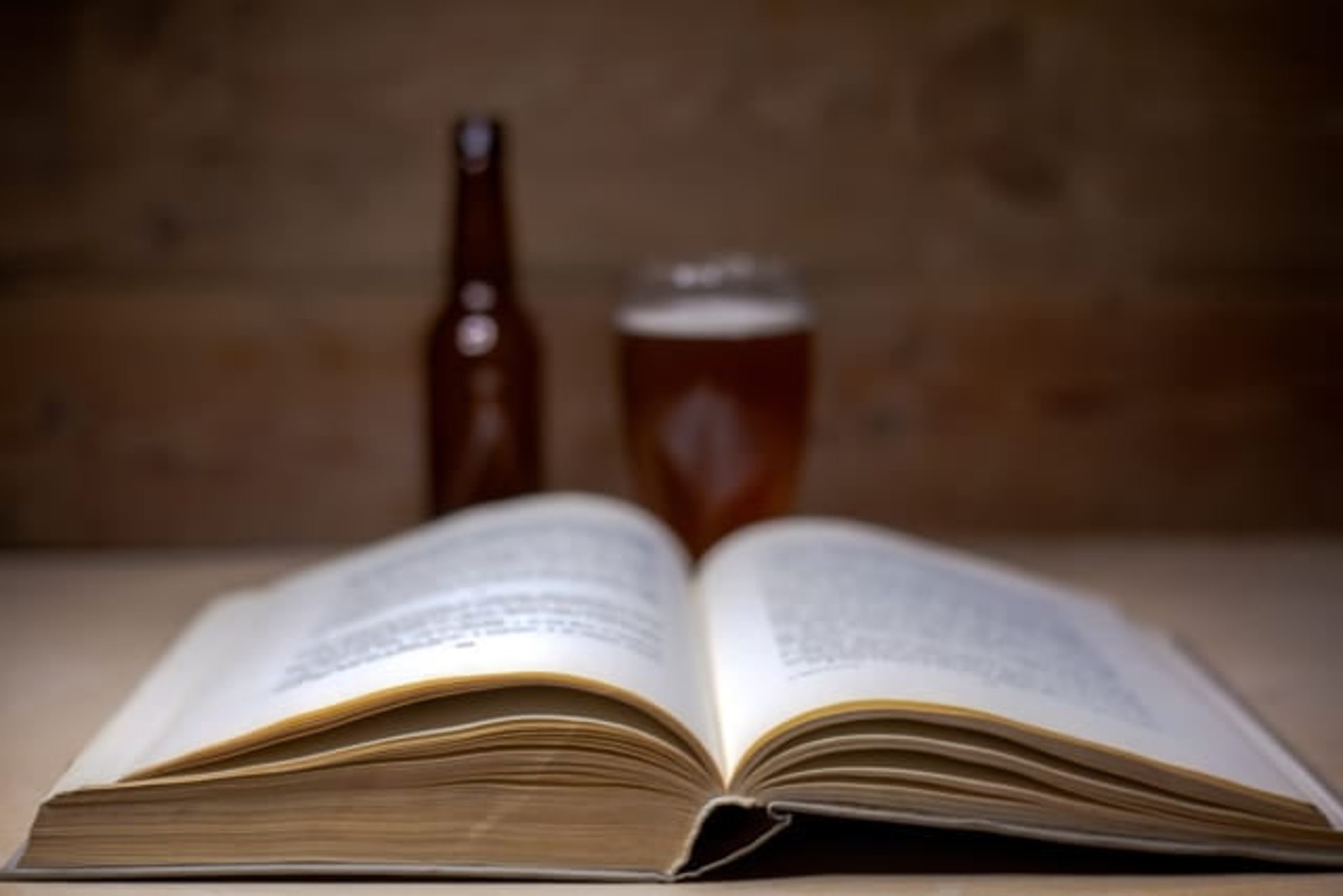
This project explores a conceptual collaboration between Oracle Brewing Co. and the Theodore Roethke Poetry and Arts Festival. I designed a series of three beer cans, each inspired by a different Roethke poem, blending craft brewing with visual storytelling to create a more immersive festival experience.
My role was to translate both the character of each beer and the emotional themes of the poems into expressive, symbolic designs. Each can functions as its own narrative while remaining visually cohesive as a collection under Oracle Brewing Co.
The challenge was to create designs that authentically reflect the identity of each beer while also capturing the deeper, often abstract themes found in Roethke’s poetry. Through color, form, and symbolism, the final designs bridge flavor and feeling, inviting viewers to engage with both the product and the poetry in a more meaningful way.
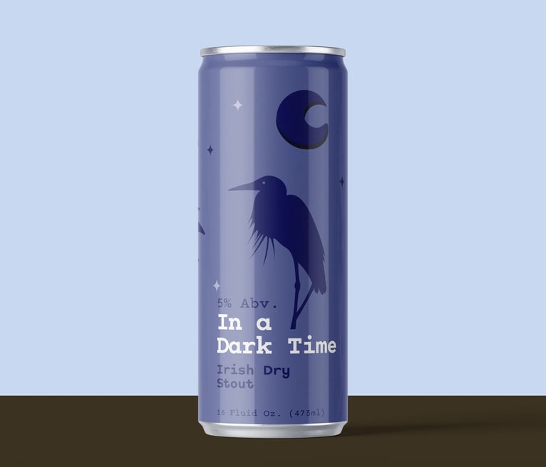
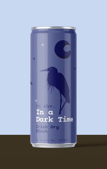
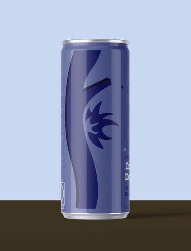
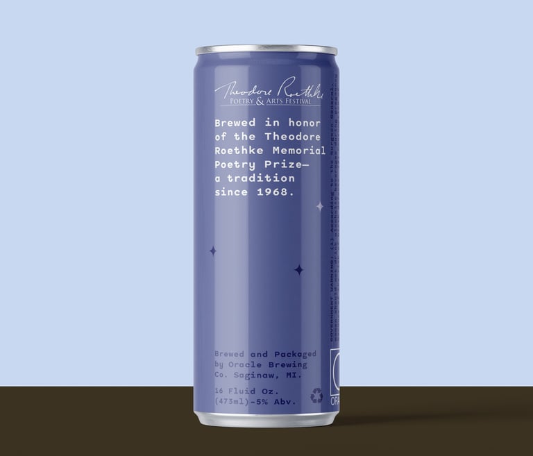
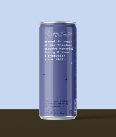
"In a Dark Time"
Irish Dry Stout
5% Abv.
16 Fluid Oz. (473 ml)
I live between the heron and the wren,
A night flowing with birds, a ragged moon,
And in broad day the midnight come again!
Design Concept
This design draws from the mood and introspection found in In a Dark Time by Theodore Roethke, using deep blue-violet tones to reflect the stillness and weight of night. The range of values creates depth, echoing the poem’s exploration of darkness as both a physical and emotional space. The moon and stars act as subtle points of guidance, while the heron connects directly to the poem’s imagery and sense of awareness within darkness.
The design also reflects the character of an Irish dry stout, known for its rich, dark body and smooth, slightly bitter finish. The deep tones mirror the beer’s appearance, while the calm, nocturnal setting evokes its slow, contemplative nature. Like the poem, the stout reveals depth beneath its darkness, tying the flavor experience to the visual and emotional tone of the design.
Theodore Roethke,
"In a Dark Time" from Collected Poems of Theodore Roethke.
“
“
”
”
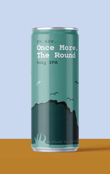
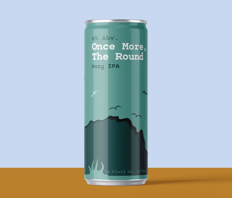
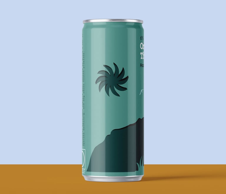
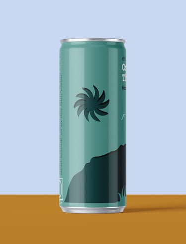
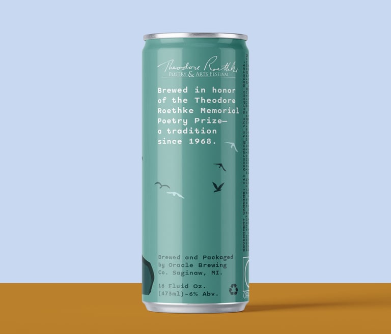
"Once More, The Round"
Hazy IPA
6% Abv.
16 Fluid Oz. (473 ml)
Design Concept
This design is inspired by Once More, the Round by Theodore Roethke, capturing a sense of movement, freedom, and connection to nature. The rugged mountain peak serves as the central form, reflecting the poem’s imagery of running toward the hill and reaching a higher, more instinctive state of self. Surrounding birds in motion echo the line “as we dance on, dance, dance on,” transforming the landscape into something alive and rhythmic, while the abstract sun reinforces this energy as a symbol of motion and vitality.
The design also connects to the bright, expressive character of a hazy IPA. Known for its juicy, vibrant flavor and lighter, clouded appearance, the beer contrasts the heaviness of darker styles and leans into a more energetic, uplifting experience. The open landscape, movement of the birds, and radiant sun mirror this liveliness, creating a visual that feels active and expansive. Together, the elements translate both the poem and the beer into a shared sense of motion, energy, and natural expression.
My true self runs toward a Hill.
As we dance on, dance on, dance on.
Theodore Roethke,
"Once More, The Round" from Collected Poems of Theodore Roethke.
“
“
”
”
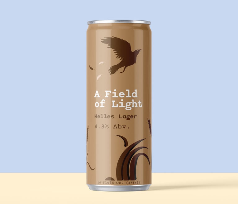
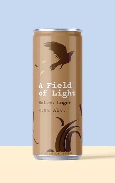
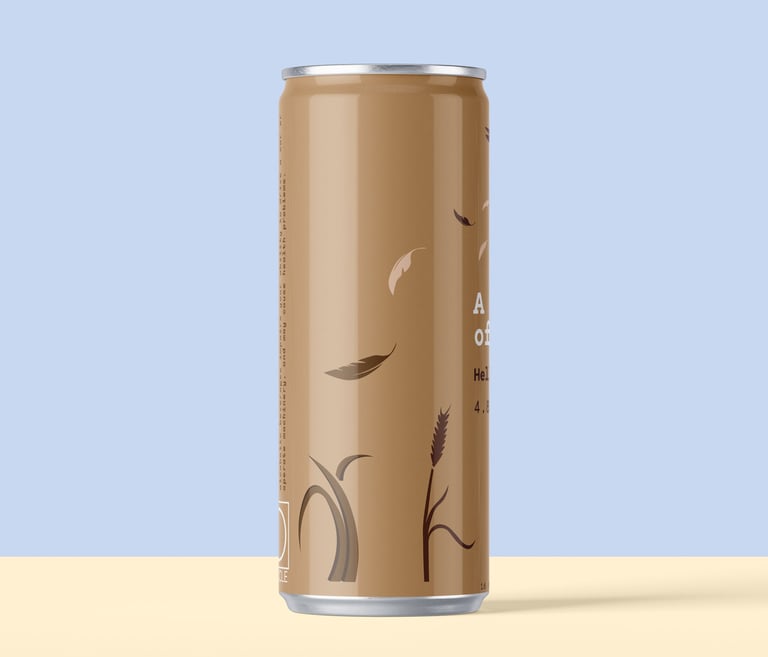
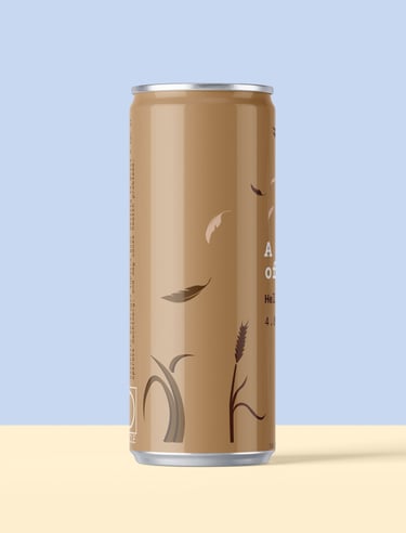
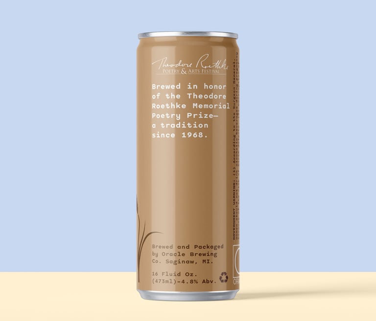
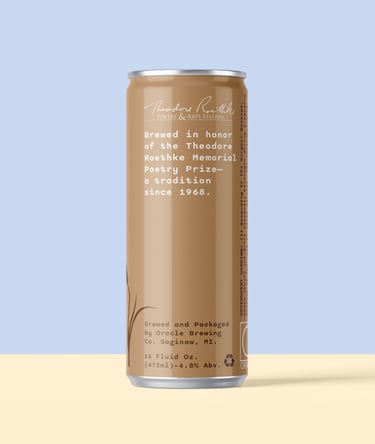
"A Field of Light"
Helles Lager
4.8% Abv.
16 Fluid Oz. (473 ml)
Design Concept
This design is inspired by A Field of Light by Theodore Roethke, focusing on the quiet awareness and subtle movement found within nature. The tall grass and weeds create a layered environment that encourages the viewer to slow down and notice the small details, much like the poem itself. The crow acts as the central focal point, while its drifting feathers introduce a sense of gentle motion, guiding the eye around the can and reflecting the poem’s attention to fleeting sounds and movements.
The design also connects to the character of a Helles lager, which is known for its balanced, smooth, and approachable flavor. The warm brown tones echo the beer’s subtle malt profile, while the calm, grounded imagery reflects its easy-drinking nature. Like the poem, the beer is not overwhelming but instead invites a more attentive and thoughtful experience, where simplicity and nuance become the focus.
Beating its wings. The great elm filled with birds.
In the deep grass at the edge of field.
Theodore Roethke,
"A Field of Light" from Collected Poems of Theodore Roethke.
“
“
”
”
These designs connect the craft beers of Oracle Brewing Co. with the poetry of Theodore Roethke by translating each poem’s themes into visual experiences that reflect both meaning and flavor. Each can captures the tone of its poem while aligning with the character of the beer, creating a more immersive and engaging connection for the viewer.
The designs also reflect Oracle Brewing Co.’s simpler, modern aesthetic through clean composition, limited color palettes, and clear focal points. As a series, the cans feel cohesive through shared symbolism and atmosphere, while varied layouts create enough contrast to give each design its own distinct identity.