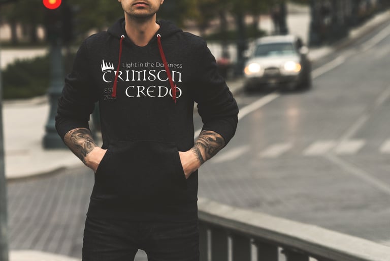
Crimson Credo Apparel
Designs made for the young and devoted Catholics and Christians who
Date: 2025
Software: Adobe Illustrator


Crimson Credo Apparel
A new apparel brand for Catholics desiring a unique way to show off their faith in their daily lives.
Who we are
Crimson Credo exists to reveal the raw truth of Jesus Christ a faith shaped by His suffering, sacrifice and redeeming love. Our mission is to show the beauty found in the broken, the holiness within wounds, and the hope that rises from the Cross. We create for those who belong in Christ while wanting to dress with an edgier style while showing their faith, thus reimagining Catholic tradition through a darker, grunge-inspired lens.
Every design reflects the blood, grit, and honesty of Christ’s love, a love that was not clean, but crucified. Crimson Credo does not polish faith; it uncovers redemption as it truly is, carved through suffering and brought to life again in love.
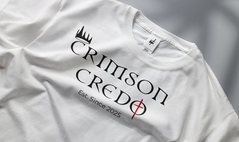
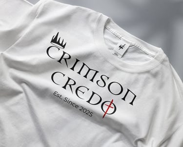
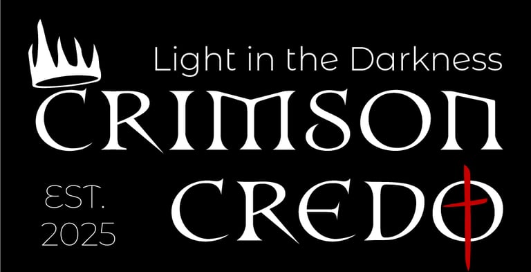
The Logo
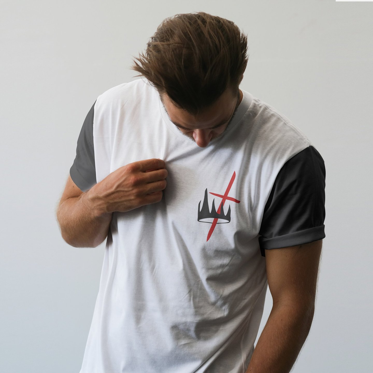
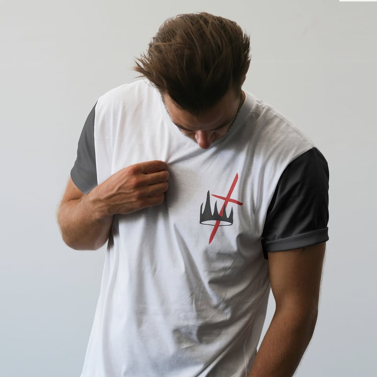
A logo created to represent the brand clearly in a way that can't be missed. The words Crimson Credo represent a covenant made between Jesus Christ and man. A relationship sealed with Jesus's blood when he was crucified on a cross. Thus, this explains the crimson aspect and the covenant or relationship representing the credo part of the name. The red cross stands out as a focal point which signifies Jesus Christ's sacrifice being the way to sanctifying grace. A rugged crown above the "C" in crimson represents Christ being a king.
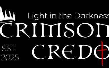
The logo is perfectly balanced. since the crown sits above the first "C" in the logo it enables it to be right justified to include the brands slogan. The first logo is the brands main way of showing the logo, but it can be right justified only when combined with the slogan. The logo can either be in all black or all white on contrasting backgrounds.
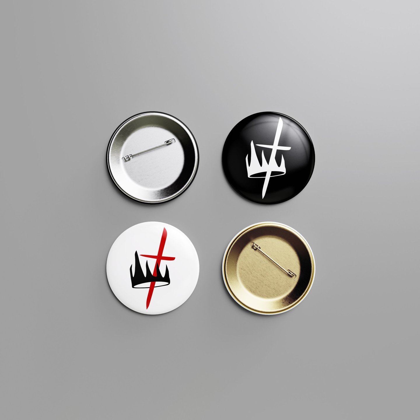
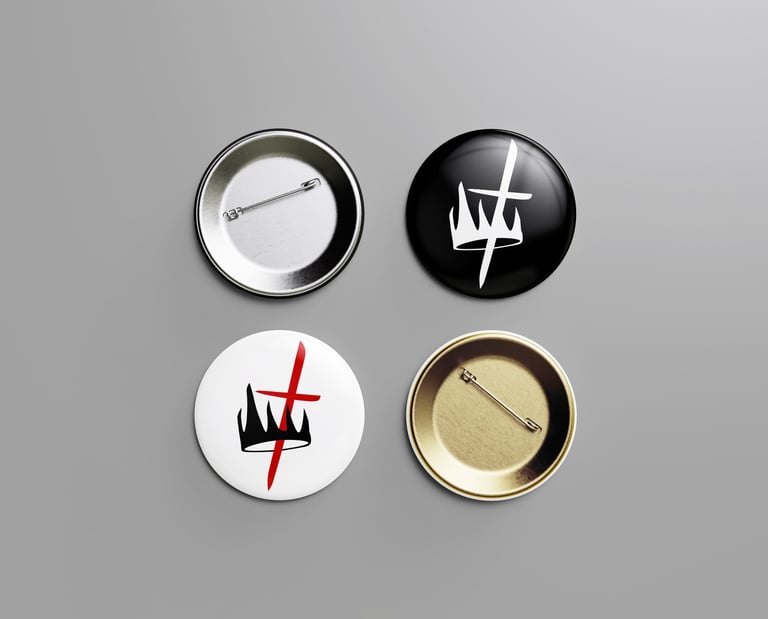


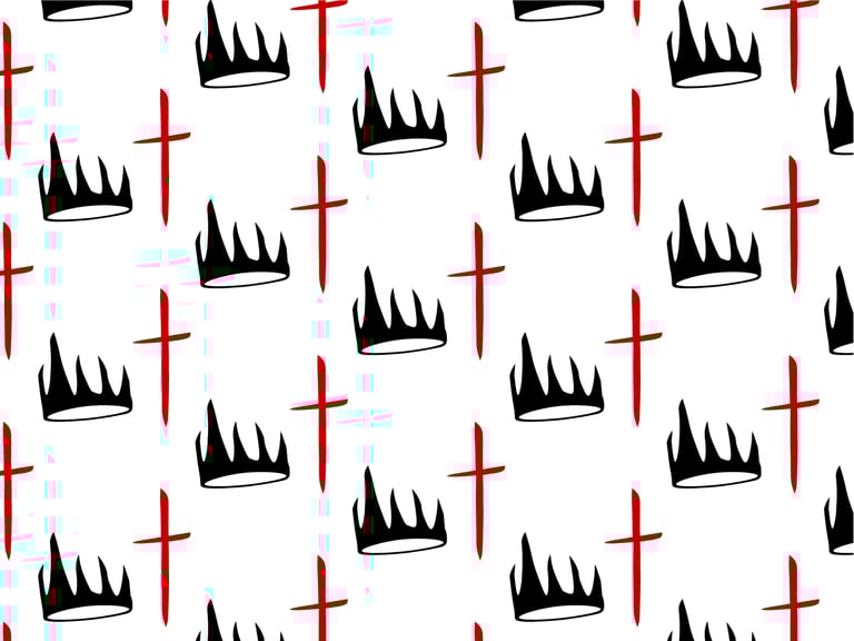
The Brand Mark
The brand mark allows the brand to have a secondary logo that represents the brand in a simplified way. The brand mark does not replace the main logo but enhances it.
The Value of Color
Crimson Credo’s colors reflect the depth, struggle, and hope at the heart of the brand. Rich crimson tones echo sacrifice and redemption, while black and white create strong contrast rooted in the tension between darkness and light.
#c22026
#000000
#ffffff
#88171a
#ff9933
#a3a3a3
Both the fonts were chosen very carefully to carry out the brands voice through text in every design.
Together, Newcomen and Montserrat Alternates create a balanced visual voice: one that feels bold, modern, edgy and approachable when necessary. The pairing ensures that every piece of communication — from apparel design to written materials — carries the brand’s spirit of reverence, edge and redemptive truth.
The Newcomen's sharp lines and heavy strokes evoke the Gothic lettering found in ancient Catholic manuscripts and cathedrals, grounding the brand in its spiritual roots. At the same time, its bold and angular construction brings an edgy and gothic-inspired, contemporary feel that aligns with Crimson Credo’s raw and unapologetic tone.
Montserrat Alternates serves as the secondary typeface for Crimson Credo, providing a modern balance to the bold, historic character of Newcomen. Its clean, geometric forms ensure strong readability across both print and digital applications.
NEWCOMEN
(Customized)
Montserrat Alternates
Meaningful Typography
Meaningful typeface chosen carefully to support the brands unique voice within each design.
“
”
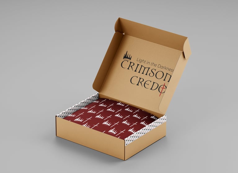
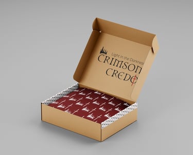
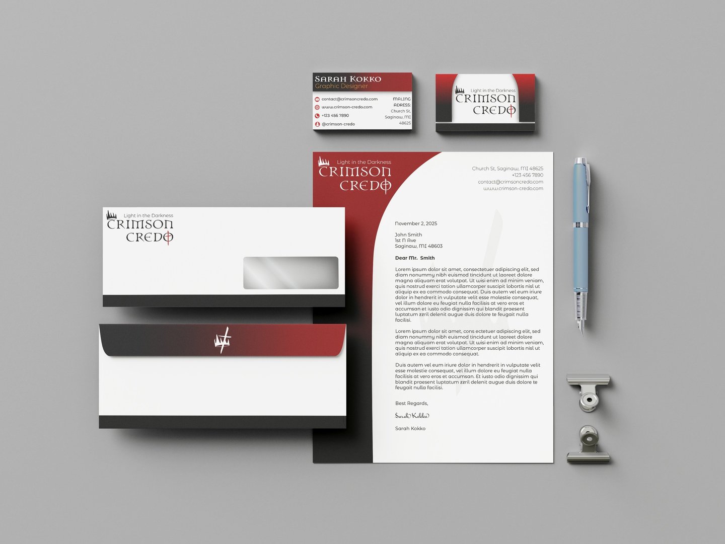
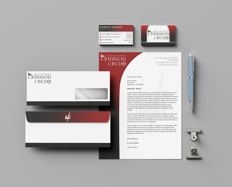
Stationary & Packaging
Crimson Credo’s packaging uses bold, branded elements—like the marked tape and exterior messaging—to create an immediate and memorable visual impact.
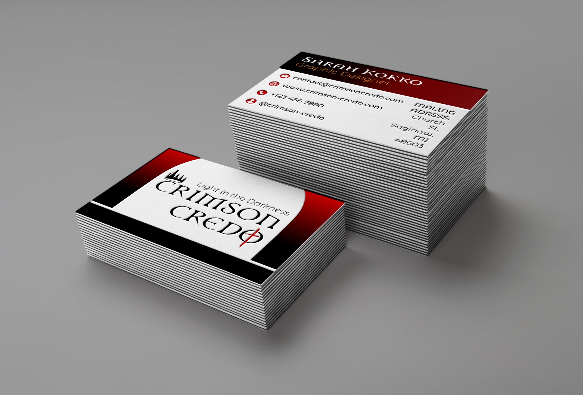
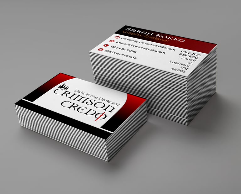
Crimson Credo’s stationery and business cards use the pointed arch—drawn from traditional church architecture—to frame each layout with a sense of sacred structure and identity. A red-to-black gradient adds depth and visual interest, creating a striking foundation that reflects the brand’s bold and reverent aesthetic.