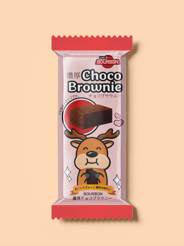
Choco Brownie Candy
Exploration of combing English and Japanese typeface.
Date: 2025
Software: Adobe Illustrator, Procreate


Design Concept
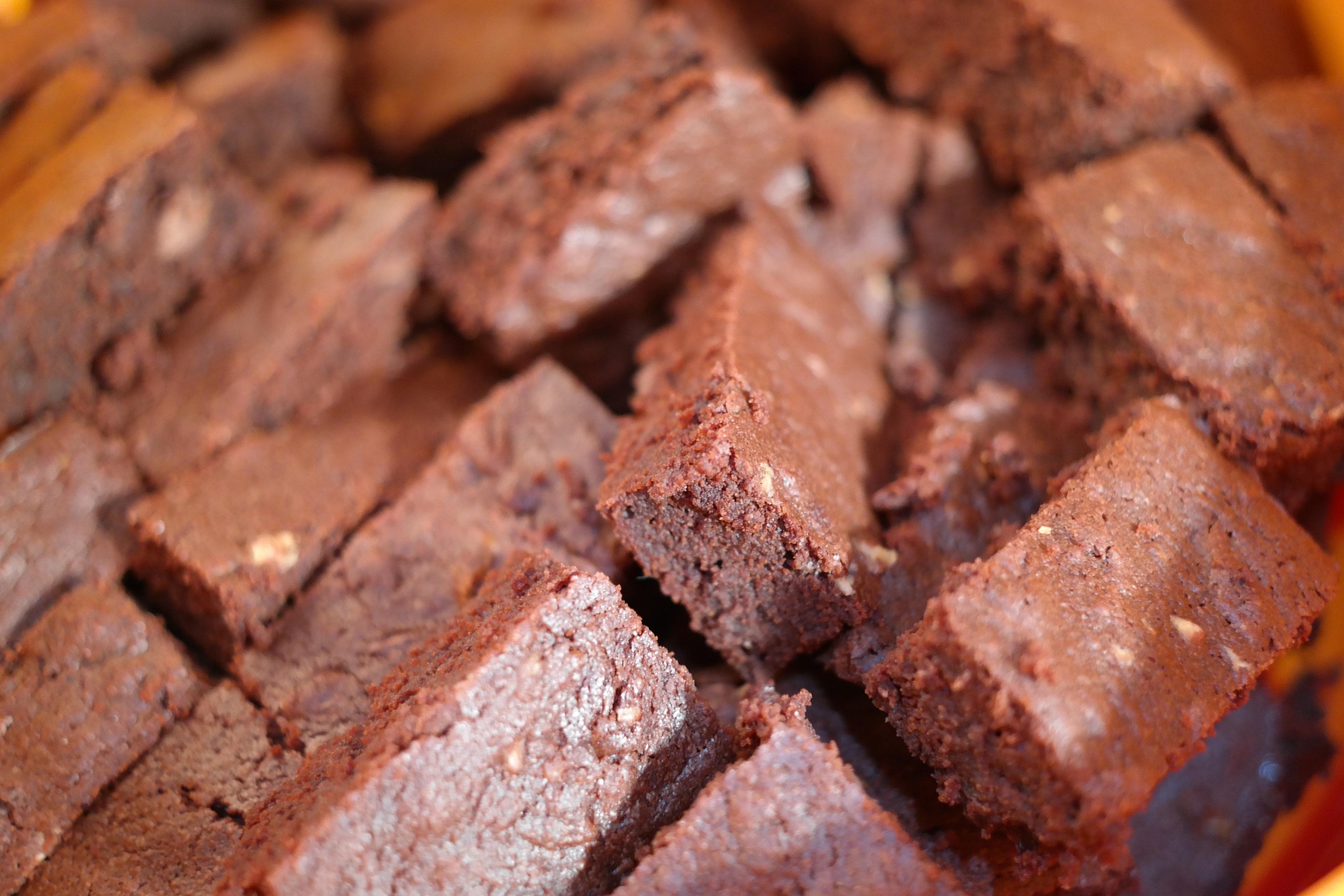
This packaging design creates a playful and inviting identity that reflects the sweetness of the product and the charm of Japanese confectionery. The focal point is a kawaii-style deer holding a brownie with a content expression, evoking comfort and delight. The deer was chosen for its cultural significance in Japan and its association with popular tourist locations where deer interact with visitors, adding a subtle storytelling element.
Supporting elements guide attention without competing with the focal point. A red circle outlined in white and black references the Japanese flag and acts as a visual anchor, while the brownie image placed over it draws focus to the product. Kawaii icons like stars and hearts enhance the playful tone. The brand name appears twice, once in the top corner and again beneath the deer on a gold banner, reinforcing brand recognition and structure.
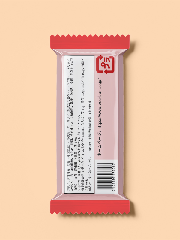
This design combines English and Japanese typography to reflect the Bourbon candy brand. The product name appears prominently in English for readability, with smaller Japanese characters alongside it to maintain authenticity.
This approach balances global appeal with cultural identity. English makes the product accessible to a wider audience, while Japanese adds visual interest and reinforces its origin. The contrast in type hierarchy adds depth without overwhelming the design. Together, this blend reflects modern Japanese packaging, where combining languages enhances both marketability and visual appeal.