Coy's Comics
Coy's Comics is a Saginaw local comic bookstore. I have taken their old logo and branding style and created a more update look that could better enhance their brand and customer outreach.
Date: 2025
Software: Adobe Illustrator
Coy's Comics is a local comic bookstore in Saginaw Michigan. Their mission statement is seen below.
"The best in comics, collectibles, and customer service for over 35 years! We can't wait to provide you with the best customer service around whether you're brand new to comics or a long-time collector!"
Their branding hasn't changed much within the last 35 years. This project focuses on rebranding of Coy's Comics to help them find a more relevant and youthful identity without losing their love for comics and a family friendly environment.
Coy's Comics Rebranding Solutions
Original Logo
The businesses logo is outdated and full of little details that go unnoticed. Design has changed within the last 35 years, while Coy's Comics has been supplying joy to families and individuals who love comics and various materials, their logo should grow and adapt with what's new.
Problem: Logo is crowded and busy including imagery and text.
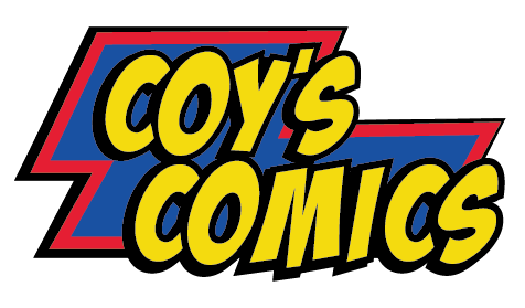
New Logo
Creating something new from the old
This logo allows the business name to stand out and even stand-alone without busy imagery cluttering space. The business has a strong business name that makes the business obvious to what it is all about so the logo doesn't need to be busy or too obvious.
The new look includes colors such as lightning yellow, vortex red, and shockwave blue, that come from the old logo. These colors scream "superhero" from DC and Marvel comics alike that every comic fanatic know and love. Most importantly using these three colors along with white and black as accents the logo is then simplified and the brands main colors they can use for touchpoints of limited which makes the brand more specific.
Brand Color Palette
The brand's color palette remains the same as the old except it gets rid of the light blue color that the brand original incorporated. These colors give the brand a bright and bold feeling.
#f1dc4b
#2d519c
#d13b3d
Brand Typeface
The logo recycles the typeface Badaboom, from the previous logo. Badaboom is a free and easily accessible typeface which is helpful for a small business like Coy's Comics. The typeface is easily recognizable in comics for big and bold moments which relates to Coy's mission to make an impact for each costumer.
Badaboom BB
Brand Touchpoints
Incorporating new ways to increase business exposure.
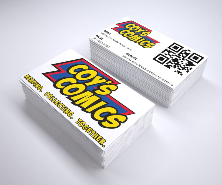
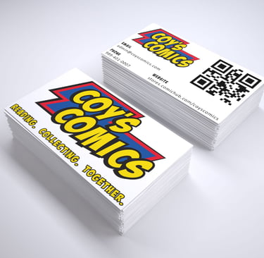
Every business needs exposure to thrive and pull in new customers. A new and direct business card with the basics like an email, phone number, and website can be a quick and easy way to give out more information about the business.
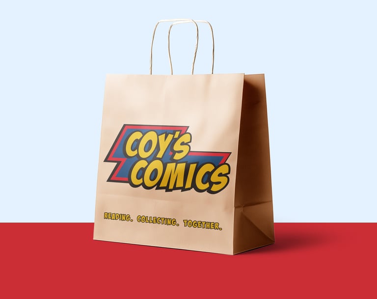
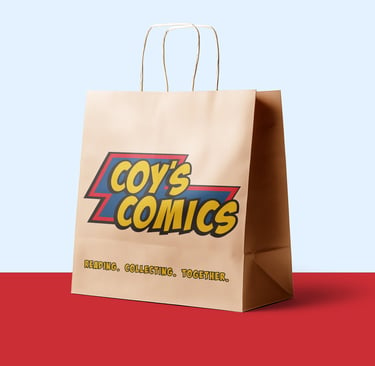
For now, Coy's Comics is using basic brown bags to bag each guest's purchased merchandise. Instead by using a bag that includes their logo in a bright and bold way can help people get more interested in their business. The bags can be reused by guests, thus giving the business more exposure to people who might have never even heard of Coy's comics.
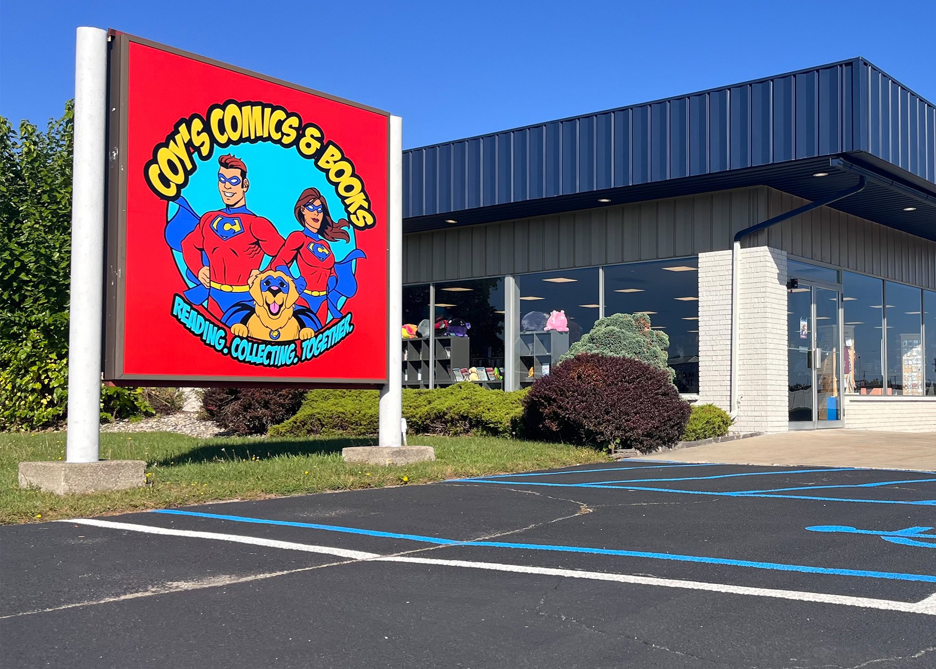
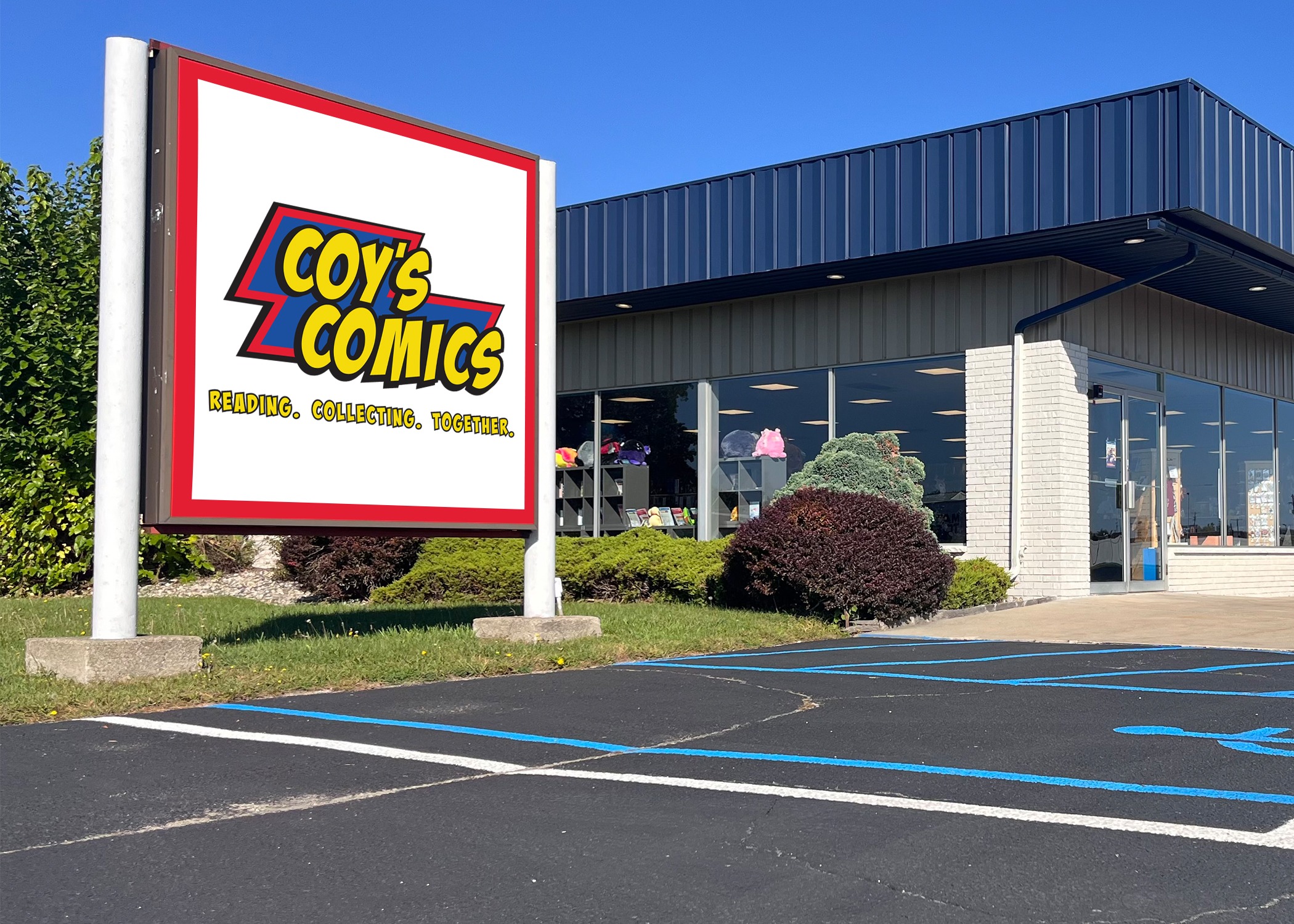
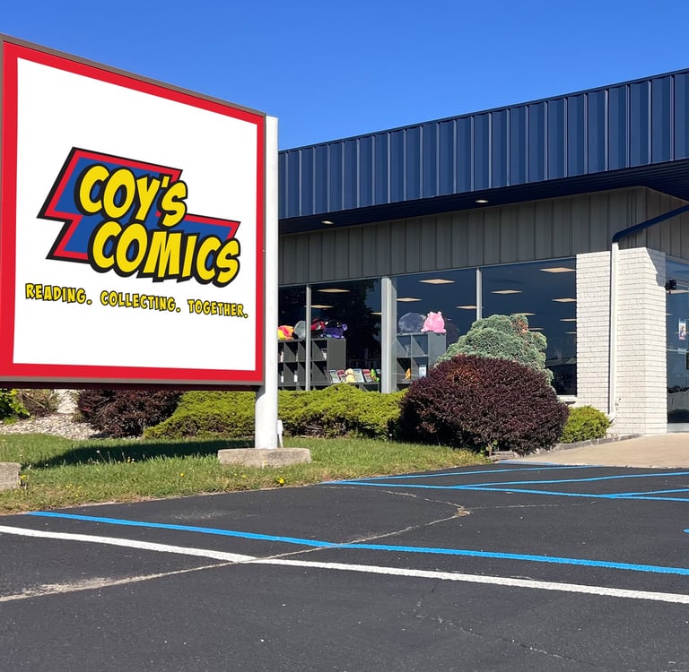
Storefront Signage Changes
Coy's Comics storefront billboard is bright and is utilized to identity their building as well as lure guests into their store. However, it could be enhanced with the new logo by keeping the name of the store highlighted. With a white background it makes the logo standout from a distance and the red background and red in the logo don't have to compete in importance.
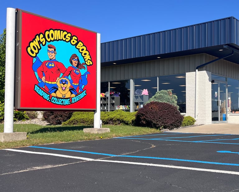
The Old
VS The New