Restagan
A new sleep aid for a younger generation.
Date: 2025
Software: Adobe Illustrator

Packaging That Stands Out
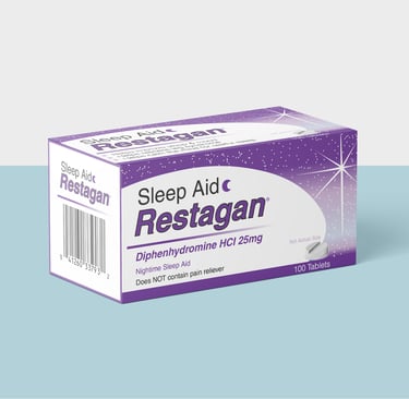
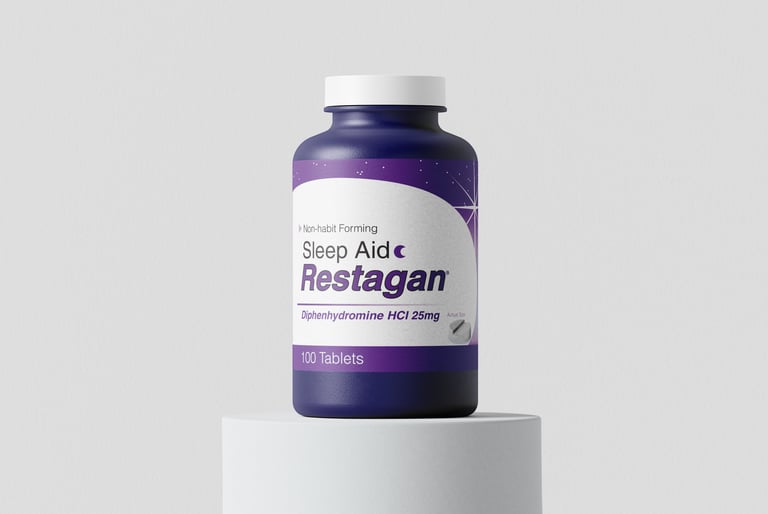
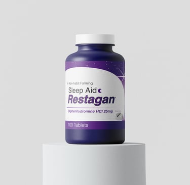
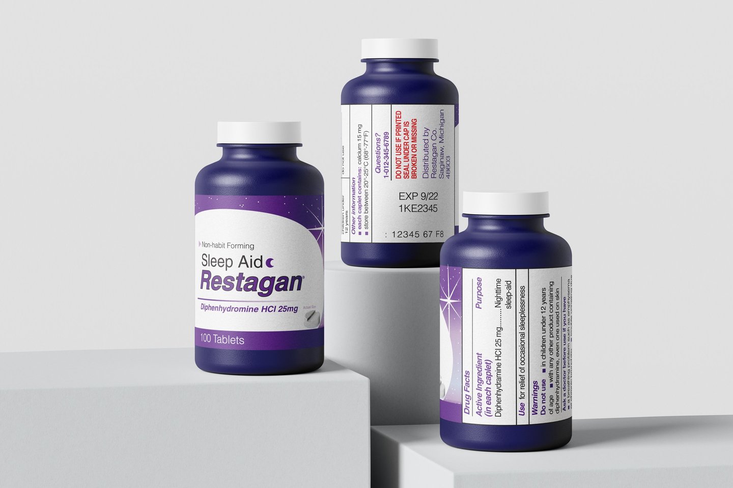
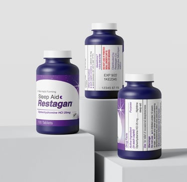
The packaging for Restagan uses a rich palette of dark purples that gradually fade into lighter tones, creating a calming visual experience that naturally connects to rest and sleep. Purple is commonly associated with melatonin and nighttime routines, so even though the product itself is not a natural sleep aid, this color choice subtly communicates familiarity and trust, helping position the brand within that space. This association can attract new buyers by giving the impression of a gentle, sleep-supportive solution while still standing out among competitors.
The use of star elements adds a sense of curiosity and visual interest, making the design feel more engaging and memorable on the shelf. These playful details reinforce the nighttime theme and create a slightly whimsical quality that can draw attention and invite consumers to take a closer look. Combined with a modern and concise layout, the overall design feels clean, approachable, and intentional. These qualities can build confidence in the product and encourage first-time purchases.


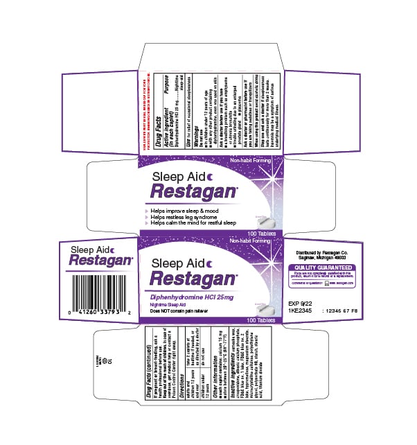
Restagan Box
The exterior packaging has been designed to capture the attention of those who are looking to find rest at night. Dark purple has taken sleep aid packaging by storm. Its highly saturated hue makes for an alluring and appealing design that especially captures a younger audience. The star in the corner of the box can resonate with the potential buyer that there is hope in finding rest again at night.
(Exterior Packaging)
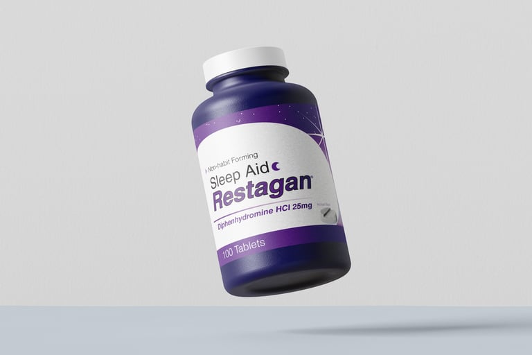
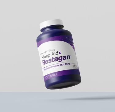
Restagan Bottle
The bottle is a dark purple color to emphasize the brand's primary color. The bottle is a simplified version of the exterior packaging. Once the buyer has made their choice purchasing Restagan they won't need as many details to inform them about the product.